When we moved in, the master bathroom was very dated and worn out. The battered vanity had no storage for toothpaste, combs, or hairdryers. The mirror was a simple piece of cut glass without decoration. The sink height was low, and the countertops were old. You can’t tell from the photos below, but the tiles were rough screen prints to fake a light blue marble. All together, this was one UGLY bathroom.
The next picture shows the updated room. New cherry vanities run wall to wall, with ample drawer storage. It’s topped with a quality granite that’s repeated in the shower with sill and shelves. We’ve replaced the tiling with a much higher grade Italian ceramic, adding decorate features like the gray border and the molded listello pieces. The massive deck is gone, opening up the picture window, and we’ve installed a new triangle soaking tub. All of the faucets are satin nickel Moen, with coordinating light fixtures and towel racks.
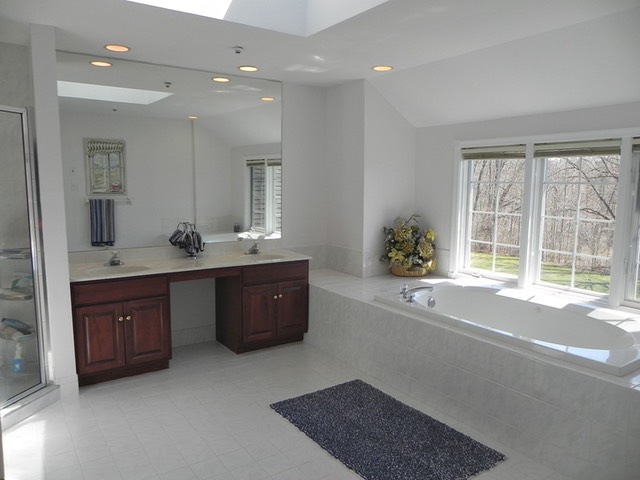
Before - Vanity, Window, Tub
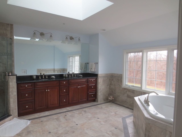
After - Vanity, Window, Tub
Before we started, the tub sat symmetrically in front of the windows in a long deck that monopolized the room and wasted a lot of space. Did I mention the old tub was also a jacuzzi tub, and it smelled?
We initially started with the idea of a free standing tub in front of the picture window, but this would still have wasted a lot of space. One contractor suggested a corner tub, and we ended up going with this idea. It’s a much more efficient use of space, and now you can enjoy the view either from the tub or standing in front of the window while brushing your teeth.
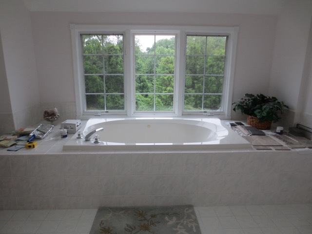
Before - The tub and window view
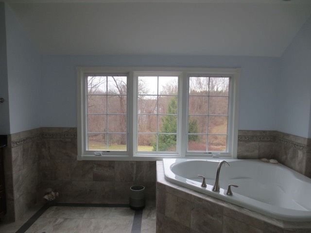
After - The tub and window view
One of the biggest monstrosities in this room was the claustrophobic shower. The door was surrounded by excess metal, which we eventually discovered was because the original builder hadn’t angled the entrance angles correctly to install a nicer door.
To improve the shower, we started by removing half of the wall, replacing it with glass. We worked with a clever carpenter to correct the angles on the left and right so that the door could be attached at 90 degrees, allowing for a frameless style. Now when you take a shower, you can look out towards the picture windows.
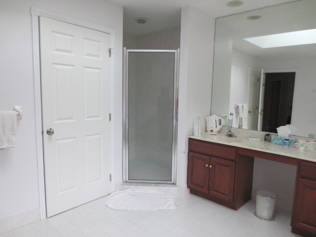
Before - The shower access
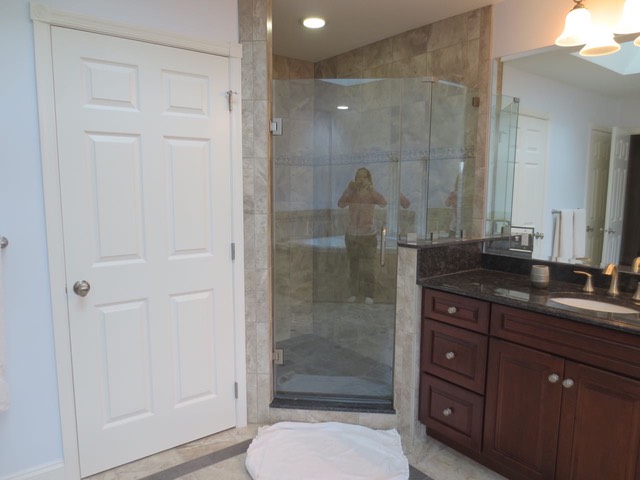
After - The shower access
To really get an idea of how awful it was to shower in this ugly box every morning, look at the floor. There was hard junk growing out of the drain (which was almost completly plugged with hair - disgusting!). There were numerous cracks in the tiling and no visible caulking at the edges. Even with the dingy overhead light, it was dark, given the arrangement with the wall blocking most of the natural light. The shower knob was broken, missing its stops, so it was hard to turn off the water all the way.
The new shower is ceiling to floor in Italian ceramic tiles that have plenty of color variations for a more natural look. A pretty molded listello sits at eye height. Granite sill and corner shelves echo the granite on the vanity. The gray floor repeats the gray border on the exterior area, surrounding a new square drain in the same satin nickel used elsewhere. There are also all new fixtures. The space is well lit and offers an excellent view out of the picture windows.
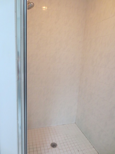
Before - Inside the shower
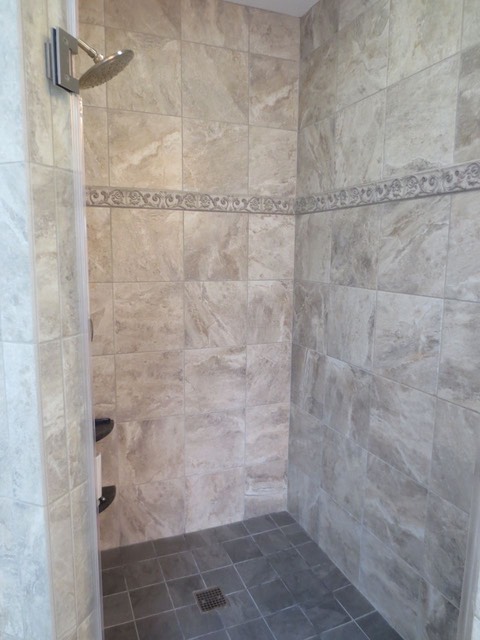
After - Inside the shower
Another view showing closet improvements...
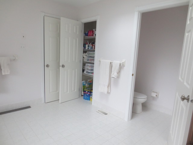
The old shelves were annoying, since nothing sat flat on the wires. And the towel racks were ugly.
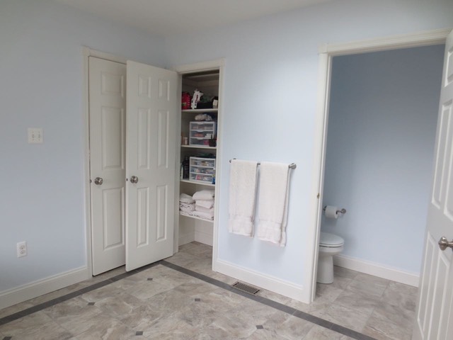
Wood shelves, new towel racks, wood baseboards, new toilet, and fresh paint!
Check out some of the work during the renovation. Talk about a complicated project!
Who did all this beautiful work?
- General contractor - Christy Devonport (me!) - including plans, procurement, and general coordination - Check out the plans
- Materials selection, creative ideas for tiling - Wayne Devonport (an eye for good taste!)
- Demolition & Carpentry - Jamie Adams, JSA Carpentry, LLC, (610) 517-0861
- Drywall & Tiling - Chuck DiCarlo, Ceramic Tile Installations, (610) 476-8858
- Electrical - Mike Muscatello, Muscatello Electrical, LLC, (267) 591-5679
- Plumbing - Tony Kyne, Kyne Plumbing & Heating/Air Conditioning Inc., (610) 356-8583
- Shower/mirror Glass - Burhan's Glass Company Inc., (610) 365-2040
- Granite, Kol Marble & Granite II Inc., (484) 483-7638
- Painting, Left Moon Painting, (484) 757-5295